The Weight of a Line
A guest essay from a letterpress printer on why setting a sentence in metal type makes you write it differently, and what a line of lead knows that a screen does not.
In this essay
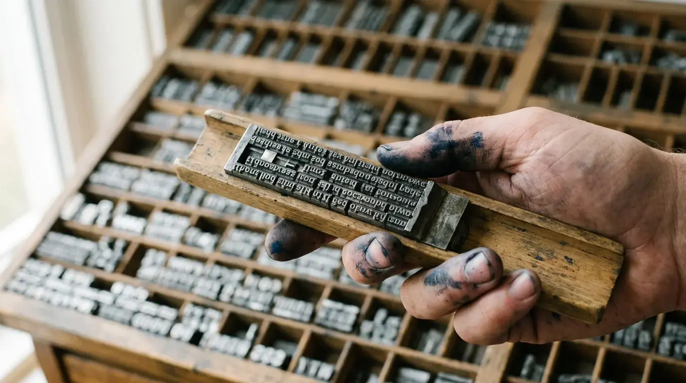
A line of metal type weighs about as much as a bar of soap. I did not expect that, in my first week, when I lifted a full stick out of the case and nearly dropped it. After nineteen years I still feel it: the physical heft of a sentence that has been turned into an object.
I set type for a living. This is an attempt to explain what that does to how you write, which Nell asked me to do and which I have been putting off, because the honest answer is that it makes you worse at some things and much better at others.
Every letter is a thing
On a screen a space is nothing. In metal it is a block of lead, a particular width, picked up with fingers and placed in the stick between two words. There are a dozen different spaces: the em, the en, the thick, the middle, the thin, the hair. A good compositor learns by feel which one a line wants.
This matters because, once you handle spaces, you cannot unsee them. A rivered paragraph, with white gaps running down through the lines like water, is obvious in a way it never was on a screen. You see the uneven word spacing in every newspaper you read. It is slightly ruinous. I recommend it.
Setting also slows you to the speed of reading. You pick up each letter, one at a time, from a case that is arranged by frequency and habit, with the commonest letters closest to hand. You place it in the stick upside down and backwards. By the time a paragraph is set you have read it, letter by letter, more carefully than any editor ever has, and you have found everything wrong with it: the repeated word, the clumsy rhythm, the sentence that says nothing.Proofreaders still call this “reading the type”: the tradition is to read a galley backwards, word by word, so that the sense of the sentence does not hide the mistakes.
Why the line breaks matter
In metal, you commit to a line break. The stick holds one line at a time, and when it is full you justify it, adding or removing thin spaces until the line locks tight. If you get it wrong the line falls out when the forme is lifted, a small disaster called pie.
So you think in lines. Not in paragraphs, not in pages, lines. A line has a weight and a length, and a bad break is not a typographic quibble but a visible flaw. A word like “the” at the end of a line is a small sorrow; a hyphen after a single letter is a worse one. I have rewritten whole sentences in the stick to avoid an ugly break, and the rewritten version is nearly always better.
This is the thing I would give to writers if I could. Not the romance of ink and lead, which is fine but cheap, but the habit of attending to a sentence as a physical shape. Read it aloud. See where it breaks. Move one word and watch what happens to the rest.
What goes wrong
It would be dishonest to sell it as pure virtue. Setting type is slow, and it favours the short. I cannot revise a long document in lead without losing a week. I do not write my own emails in a composing stick. And the habit of seeing the shape of language can curdle into fussiness, where I read a poem and notice only that the stanza breaks fall badly.
There is also the cost. A full set of metal type for a single typeface is heavy, expensive and hard to replace, and every sort lost down the back of a case is lost for good.Metal type is an alloy of lead, tin and antimony, cast in a mould for each letter. Whole fonts were once sold by weight, and some still are. Most of my customers want something that a digital press would do cheaper, and I tell them so. Some of them want the weight anyway, and those are the jobs I like.
The last line
I keep a single line of type on my desk, set years ago to test a spacing. It says only “slow is a kind of care”, which I thought was clever when I set it. It is not especially clever. But I have never been able to throw it away, because it is the only thing I have ever written that I have held in my hand.
If this was worth your time, there is a letter.
One short letter every Friday. No tracking, leave in one click.